
Guides & videos
Analysis — the statistical diagnostic of your plots
In a nutshell: Analysis records nothing. It gathers the basal area surveys made on a domain, one or more parcels and a period, and turns them into a statistical diagnostic: the mean value per hectare of each variable, how much it varies from plot to plot, and the precision of your estimate.
It is the stand diagnostic in the Pro Silva way: it answers "what is the growing stock of this parcel?", but also "are my plots enough to say so?".
1. What Analysis computes
The unit of calculation is the plot: one basal area survey, made from a route in the Observations module. A route can carry several surveys: each one is a plot. For each plot, the app already knows the basal area, the stem density and the deadwood — the figures of its summary.
Analysis lines these plot values up, variable by variable, and computes their statistics: one row per plot in a spreadsheet, one column per variable, as in the "Diag" tab of the Pro Silva workbook.
The first report available is the Diagnostic. Others will follow.
2. Choosing the scope
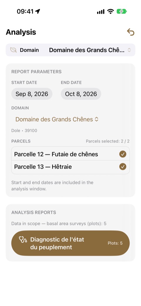
Open Analysis from the home screen.
- Domain: the one in the banner is suggested; changing it here also changes the active domain.
- Parcels: all are ticked at first. Untick those you are not interested in. The counter shows how many are kept.
- Period: start date and end date, both included — a survey made on the end date counts.
Below the selection, the app shows how many basal area surveys (plots) the scope contains. The Diagnostic button shows that number; it stays greyed out while there is no plot.
An observation that is not attached to any parcel never enters the Analysis. If surveys are missing, check their parcel in the observation's detail.
3. The Diagnostic report
At the top, a reminder of the scope: the domain, each parcel with its number of plots, the period and the total. The ↩ arrow at the top right takes you back to the scope.
Then come three sections, always in this order:
- Basal area (m²/ha);
- Stem density (stems/ha);
- Deadwood (m³/ha).
Each section begins with a definition of the variable, expanded the first time and collapsed afterwards: tap Definition to read it again.
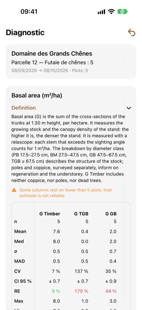
Reading a table
- In columns, the variables: G Timber, G TGB, G GB…;
- in rows, the statistics: n, Mean, Med… (detailed in § 5).
The first column stays fixed; swipe the table to the left to see the other variables. Long-press a statistic's name to show its definition.
A — marks a value that makes no sense for the sample: a standard deviation with a single plot, a coefficient of variation when the mean is zero.
4. The three sections
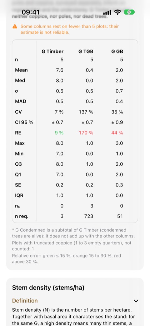
Basal area (m²/ha)
| Column | What it holds |
|---|---|
| G Timber | the living stems counted with the relascope (Timber gesture), all classes, unclassified included |
| G TGB, G GB, G BM, G PB | the same, by diameter class |
| G Coppice | coppice, estimated with the point-centred quarter method |
| G Pole | the poles in the 10 m circle |
| G Dead | trees standing dead, counted with the relascope |
| G Condemned* | condemned trees — a subtotal of G Timber |
Stem density (stems/ha)
The same columns, as stems per hectare: N Timber, N TGB, N GB, N BM, N PB, N Coppice, N Pole, N Dead.
A stem counted with the relascope without a diameter class counts in the basal area, but not in the density: its diameter is needed to convert it into stems per hectare. Their number is shown under the table.
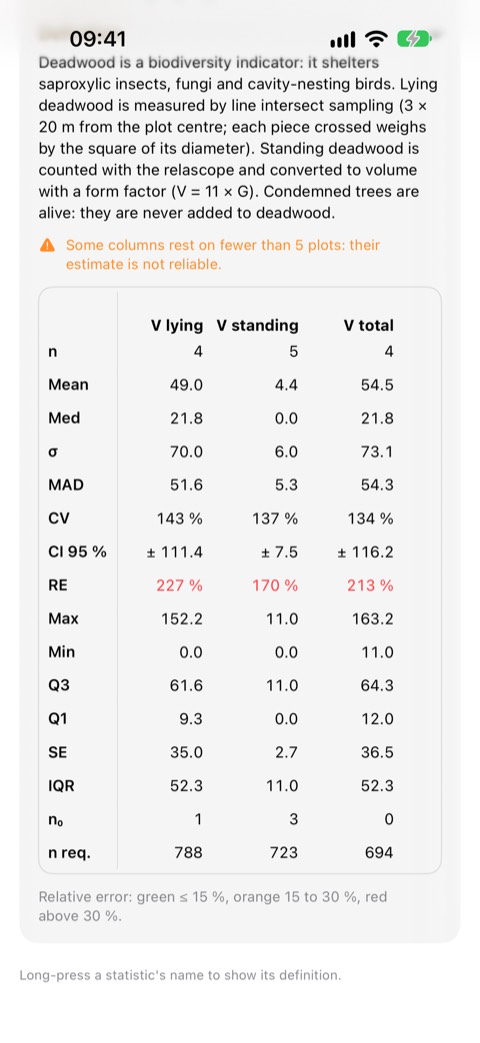
Deadwood (m³/ha)
| Column | What it holds |
|---|---|
| V lying | the volume of the pieces crossed along the three transects |
| V standing | the volume of standing dead trees (11 × G Dead) |
| V total | both together, on the plots where the transects were walked |
Zero or "not surveyed": a difference that matters
A plot where a population was surveyed and found absent counts as zero: it is information, and leaving it out would inflate the mean. A plot where it was not surveyed is simply left out of that column. That is why n can change from one column to the next.
| Population | Counts as zero if… | Left out if… |
|---|---|---|
| Timber | no stem counted | — (the relascope sweep is assumed at every plot) |
| Poles | you pressed No poles | no pole and no "No poles" |
| Coppice | all four quarters are empty | no coppice surveyed, or 1 to 3 empty quarters ("truncated plot") |
| Lying deadwood | the transects are recorded empty | no transect walked |
Plots with truncated coppice (1 to 3 empty quarters) are not computed yet: their number is shown under the table.
5. The statistics, row by row
| Row | Name | What it tells you |
|---|---|---|
| n | Count | the number of plots used for the column |
| Mean | Mean | the estimate of the variable per hectare for the scope |
| Med | Median | half the plots above, half below; a large gap with the mean betrays a few extreme plots |
| σ | Standard deviation | the spread around the mean: about two plots in three lie within one standard deviation |
| MAD | Mean absolute deviation | the average distance from a plot to the mean, less sensitive to extremes |
| CV | Coefficient of variation | the standard deviation relative to the mean, in %: the higher, the more heterogeneous the stand |
| CI 95 % | Confidence interval | the true mean has 95 chances in 100 of lying within Mean ± CI |
| RE | Relative error | the CI relative to the mean, in %: the precision of your estimate |
| Max · Min | Extremes | the highest and the lowest plot |
| Q3 · Q1 | Quartiles | three quarters / one quarter of the plots below this value; half the plots lie in between |
| SE | Standard error | the uncertainty on the mean itself (σ / √n) |
| IQR | Interquartile range | Q3 − Q1: the range of the middle half of the plots |
| n₀ | Zero plots | how many plots have none of this population |
| n req. | Required plots | how many plots would give a 10 % relative error |
6. Precision: should you add plots?
The RE row is coloured:
| Colour | Relative error | Reading |
|---|---|---|
| Green | up to 15 % | a solid estimate |
| Orange | 15 to 30 % | to be consolidated |
| Red | above 30 % | too imprecise to decide on |
The relative error falls as plots are added, but slowly: it takes four times as many plots to halve it. The n req. row does the maths for you — if it reads 19 and you have 12, seven more plots would bring the error down to 10 %.
7. In short
- One basal area survey per plot, attached to the right parcel;
- No poles and Empty transect so that zeros count;
- one scope = one sample: one parcel at a time to compare;
- look at n, then Mean, then the colour of RE;
- n req. tells you how many plots to add.